Toolbars & Focus Management
Building a rich text formatting toolbar in Jetpack Compose requires solving two key engineering challenges:
- Focus Stealing Prevention: By default in Compose, tapping any
ButtonorIconButtonrequests focus, immediately stealing focus away from the editor, dismissing the software keyboard, or collapsing the active text selection. - State Synchronization: High-level commands must seamlessly toggle formatting on selections when text is highlighted, or apply typing attributes when the cursor is collapsed.
Arranger provides high-level convenience extensions on RichTextState and recommended Compose focus management patterns to build professional formatting toolbars with minimal boilerplate.
The Focus Stealing Problem & Modifier.focusProperties
When a user taps a "Bold" button on a toolbar:
- Compose's default pointer focus pipeline attempts to transfer focus to the button.
- The editor loses focus.
- The software keyboard closes, and the selection range collapses.
The Solution: canFocus = false
To prevent toolbar buttons from ever requesting focus, apply Modifier.focusProperties { canFocus = false } to every interactive toolbar element:
val unfocusableModifier = Modifier.focusProperties { canFocus = false }

IconButton(
    onClick = { state.toggleFormat(BoldKey) },
    modifier = unfocusableModifier,
) {
    Icon(painter = painterResource(Res.drawable.format_bold), contentDescription = "Bold")
}
This guarantees that:
- The cursor remains active in the editor.
- The software keyboard stays open.
- The active text selection is preserved.
High-Level Formatting APIs
RichTextState provides high-level convenience functions to toggle, apply, or clear formatting without requiring manual state.edit { ... } blocks:
1. toggleFormat
Toggles Unit-based span or paragraph attributes. If text is selected, the format is toggled across the selection. If the cursor is collapsed, the format is toggled in typingAttributes:
// Toggle Bold, Italic, Underline, Strikethrough, or Blockquote
state.toggleFormat(BoldKey)
state.toggleFormat(ItalicKey)
state.toggleFormat(BlockquoteKey)
2. applyFormat & removeFormat
Applies or removes parameterized attributes (such as colors, font sizes, heading levels, or list levels):
// Apply Heading 1
state.applyFormat(HeadingKey, HeadingLevel.H1)

// Apply custom text color
state.applyFormat(TextColorKey, Color.Red.toRgbaColor())

// Remove Heading
state.removeFormat(HeadingKey)
3. clearFormats
Instantly removes all styling from the selected text or clears typing attributes:
4. detectAndApplyLinks
Scans the document text and automatically converts all discovered web URLs into LinkKey spans:
Complete Document Editor Sample
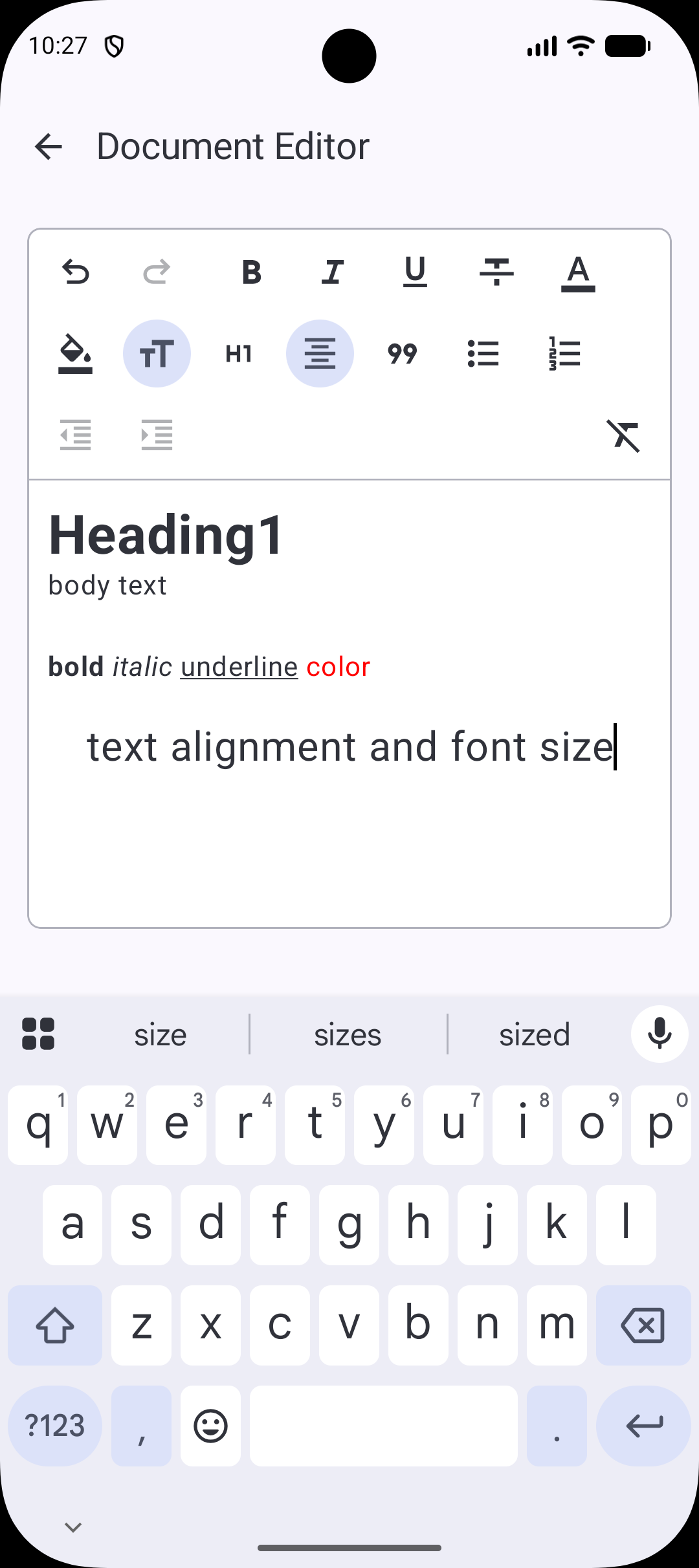
The following screenshot demonstrates a full document editor with formatting toolbar, undo/redo controls, and heading toggles:
Essential Toolbar Setup
@Composable
fun DocumentToolbar(state: RichTextState, modifier: Modifier = Modifier) {
    // Prevent buttons from stealing focus from the editor!
    val unfocusable = Modifier.focusProperties { canFocus = false }

    FlowRow(modifier = modifier) {
        // Undo / Redo
        IconButton(
            onClick = { state.undoState.undo() },
            enabled = state.undoState.canUndo,
            modifier = unfocusable
        ) { Text("↶") }

        // Bold toggle
        IconToggleButton(
            checked = state.currentAttributes.containsKey(BoldKey),
            onCheckedChange = { state.toggleFormat(BoldKey) },
            modifier = unfocusable
        ) { Text("B") }

        // Heading 1 toggle
        IconToggleButton(
            checked = state.currentAttributes[HeadingKey] == HeadingLevel.H1,
            onCheckedChange = {
                if (state.currentAttributes[HeadingKey] == HeadingLevel.H1) {
                    state.removeFormat(HeadingKey)
                } else {
                    state.applyFormat(HeadingKey, HeadingLevel.H1)
                }
            },
            modifier = unfocusable
        ) { Text("H1") }

        // Clear formatting
        IconButton(
            onClick = { state.clearFormats() },
            modifier = unfocusable
        ) { Text("✕ Clear") }
    }
}
For the complete, production-ready implementation of the document editor screen (with responsive layout, keyboard padding, and full button sets), check out the sample repository:
Summary
- Always add
Modifier.focusProperties { canFocus = false }to toolbar buttons to prevent focus loss, keyboard closing, and selection collapse. - Use
state.toggleFormat()for Unit-based attributes (BoldKey,ItalicKey,UnderlineKey, etc.). - Use
state.applyFormat()andstate.removeFormat()for parameterized attributes (TextColorKey,HeadingKey,BulletListKey, etc.). - Use
state.detectAndApplyLinks()to auto-link URLs in document text. - Refer to DocumentEditorSample.kt for the complete reference implementation.